How to create a dashboard
Introduction
Biotz provides a dashboarding tool that can be used to visualize the data coming from the devices.
Prerequisites
In order to create a dashboard having a device-type with at least one message type and schema is required. Having a device that has already sent some data is also recommended to visualize the created panels straight away and have a faster feedback loop.
Creating a dashboard
Dashboards are created from the “Dashboards” list. Just a name and an optional description are requested.
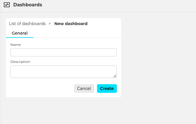
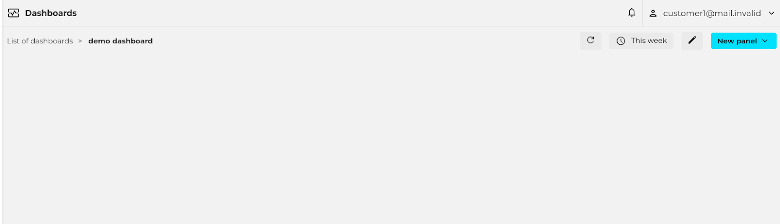
When clicking on “create” an empty dashboard is created.
Creating panels
A dashboard is composed of one or more panels. To create a new one use the “New panel” button and select the type of panel to create.
At the moment the available panel types are the following: time-series, pie chart, gauge and device map.
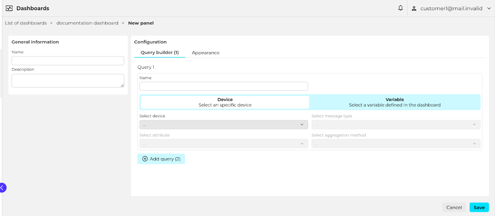
General information
Name the panel and optionally set a description.
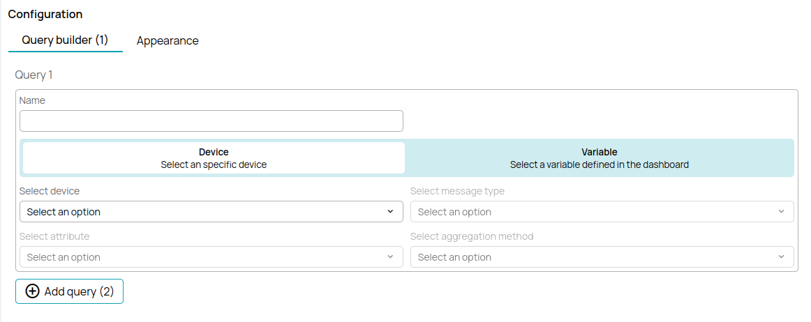
Configuration
(make this type dependent)
Time series
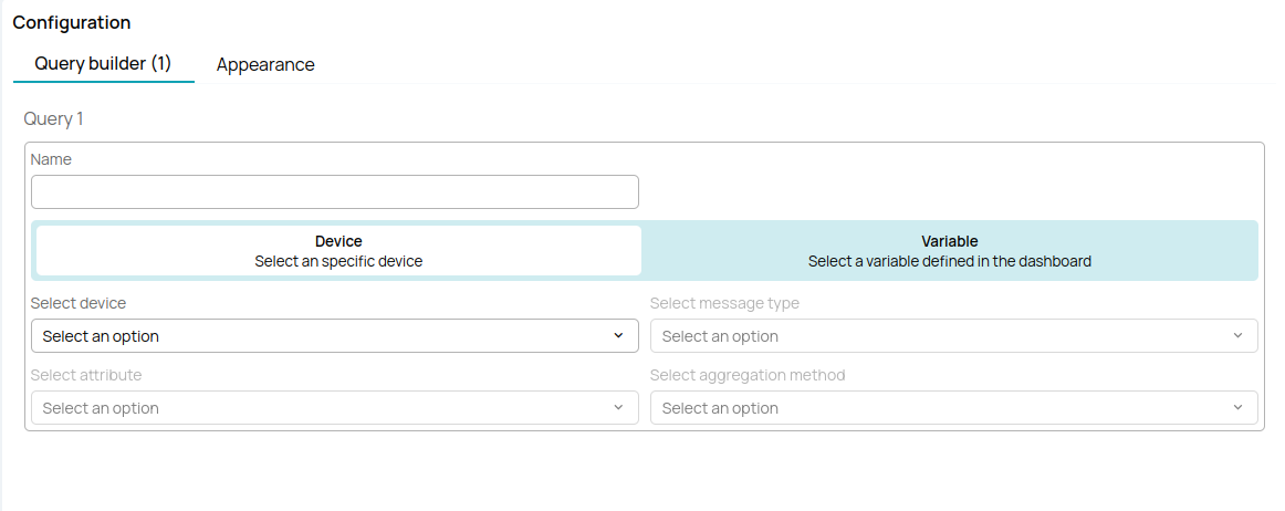
Query builder
The query builder is used to define which data will the panel display. The x-axis will always be the time, and the y axis will contain one or more time-series lines. Each line is defined by an independent query.
Defining a query requires the following configuration:
- Selecting a device or device variable. Each line in the chart can show the data of a single device. The device to be used can be fixed and defined at panel creation time, or determined by a dashboard variable (see this for more info).
- Message type and attribute. Each line in the chart can show the data of a single message type attribute.
- Aggregation method. The method used to aggregate the devices data to adapt the number of displayed points to the user's screen size and zoom level.
Attribute type and Available aggregation methods
- Numeric: Count, maximum, minimum, mean, standard deviation, and sum.
- Boolean: Count
- Text: Count
The reason for aggregating the data is performance. Lets say a certain device is sending data observations every second, and the user wants to display the data of a whole month. That would result in 2,678,400 data points. Displaying so many data points would be technically impossible for the browser because of the limited amount of pixels that a screen can display. Also, it would be very CPU heavy. To avoid that, the dashboard panel aggregates data to adapt to the screen size and chosen zoom level.
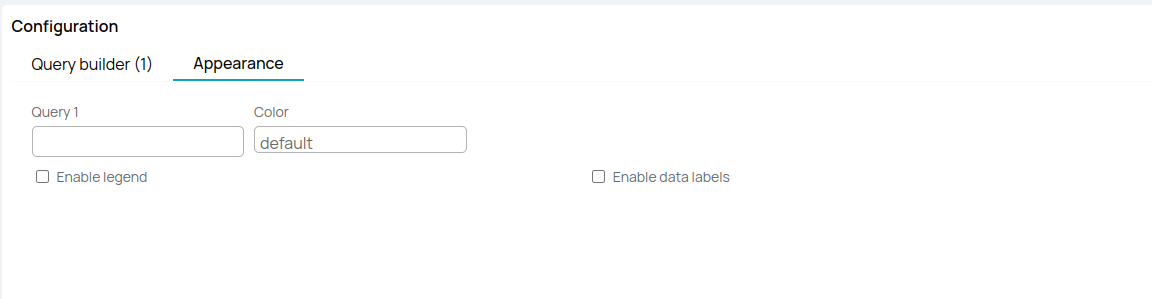
Appearance
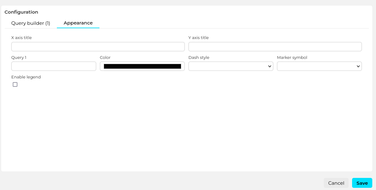
The following appearance related options are available:
- X axis title
- Y axis title
- Series appearance (configurable for each of them)
- Display name
- Color
- Dash style
- Marker symbol
- Enable/disable legend
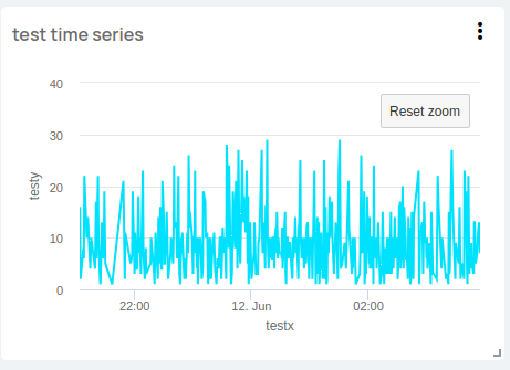
This woul be an example of a time series panel:
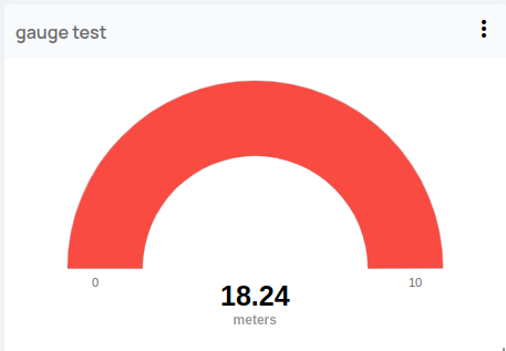
Gauge
Query builder
The query builder is used to define which data will the gauge display. A gauge shows the aggregation of a certain device message-type attribute in the selected time-frame period.
Defining the query requires the following configuration:
- Selecting a device or device variable. Each gauge can show the data of a single device. The device to be used can be fixed and defined at panel creation time, or determined by a dashboard variable (see this for more info).
- Message type and attribute. Each gauge can work with a single attribute.
- Aggregation method. The data for the selected device and attribute will be aggregated using this method. Note that the special “first” and “last” aggregation methods are also available that show a single data point.
Attribute type and Available aggregation methods
- Numeric: Count, maximum, minimum, mean, standard deviation, sum, first and last.
- Boolean: Count, first and last.
- Text: Count, first and last.
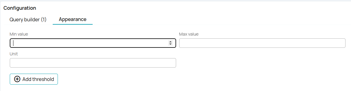
Appearance
The following appearance related options are available:
- Min value
- Max value
- Unit
- Thresholds: the gauge can represent multiple threshold values using colors.
- Percentage
- Color
This would be an exaple of a gauge panel:
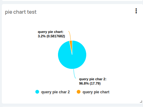
Pie chart
Query builder
The query builder is used to define which data will the pie chart display. Each segment of the pie is defined by an independent query that displays the aggregation of a certain device message type attribute.

Defining the query requires the following configuration:
- Selecting a device or device variable. Each pie segment can show the data of a single device. The device to be used can be fixed and defined at panel creation time, or determined by a dashboard variable (see this for more info).
- Message type and attribute. Each pie segment can work with a single attribute.
- Aggregation method. The data for the selected device and attribute will be aggregated using this method. Note that the special “first” and “last” aggregation methods are also available that show a single data point.
Attribute type and Available aggregation methods
- Numeric: Count, maximum, minimum, mean, standard deviation, sum, first and last.
- Boolean: Count, first and last.
- Text: Count, first and last.
Appearance
The following appearance related options are available:
- Enable/disable legend
- Enable/disable data-labels
- Segments appearance
- Display name
- Color
This would be an example of a pie chart panel:
State chart
Query builder
The query builder is used to define which data will the state chart display. Each chart can show the data from one variable.

Defining the query requires the following configuration:
- Selecting a device or device variable. The device to be used can be fixed and defined at panel creation time, or determined by a dashboard variable (see this for more info).
- Message type and attribute.
- Aggregation method. The data for the selected device and attribute will be aggregated using this method. Note that the special “first” and “last” aggregation methods are also available that show a single data point.
Attribute type and Available aggregation methods
- Numeric: Count, maximum, minimum, mean, standard deviation, sum, first and last.
- Boolean: Count, first and last.
- Text: Count, first and last.
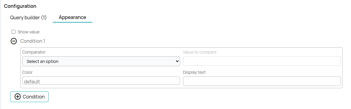
Appearance
The following appearance related options are available:
- Enable/disable value with unit marker.
- Conditions for different styles, applies the first that's true
- Color
- Text to display
This would be an example of a state chart panel:

Device map
Query builder
The query builder is used to define which data will the device map show.
Query Builder Functionality:
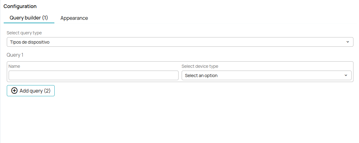
Defining the query requires the following configuration:
- In the query builder, you can first choose the type of device or have the option to select all devices. If you choose to select a specific device, you can name the type of device.
- In the appearance section, you cannot make any changes because The appearance of the panel cannot be configured.
Device Type Selection:
- After choosing the device type you want, you can save the panel, and it should appear on the dashboard with a map and the selected device types.
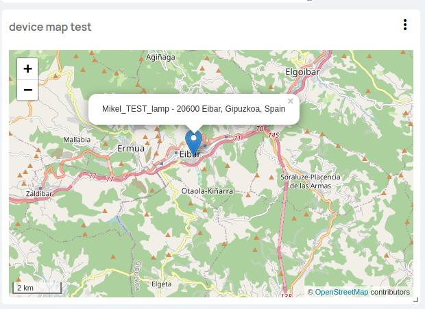
This would be an example of a device map panel:
After creating one of these panels, you should select the dashboard for which you have created the panel, and you should see all the panels you have created for that dashboard. The panels vary depending on the type of panel and its configuration. d